Portfolio Project: Ilusive Projection Festival
Assets: Logo, branding, menu design, wine label, blood bags, invitation, custom wax stamp, business cards,
t-shirts
Background: Koven, is a 273-year-old vampire on a noble mission to host blood drives, all with the intent of acquiring blood without causing harm. Participants willingly donate blood, with Koven meticulously collecting it in blood bags tailored to their specific blood types. In return for their generosity, guests are treated to an elegant black-tie dinner party, creating a uniquely macabre yet festive experience.
Execution: Design, concept development, naming, copywriting, tagline, and messaging
-
The Koven logo embodies a blend of romantic, traditional gothic aesthetics with a contemporary twist. Set in a modern blackletter typeface, it's complemented by a hand-painted rendition of the red cross, complete with a dripping point of blood. These logos are versatile, designed to be used independently or co-branded as needed.
-
Invitations are sent in envelopes stamped with the distinctive Koven wax seal monogram, opening into a cross shape to reinforce the blood drive theme and set the tone for the event.
-
The menu features custom-written descriptions, offering a selection of foods inspired by the cuisine of Romania, alongside items fitting for the occasion and the vampire theme.
The Musical Personality of Coffee Packaging: How 3 Iconic Classical Composers Inspired Robust Coffee Blends

Project: Tempo Coffee Branding/Packaging
Role: Graphic Design, Naming
Brand Position
-
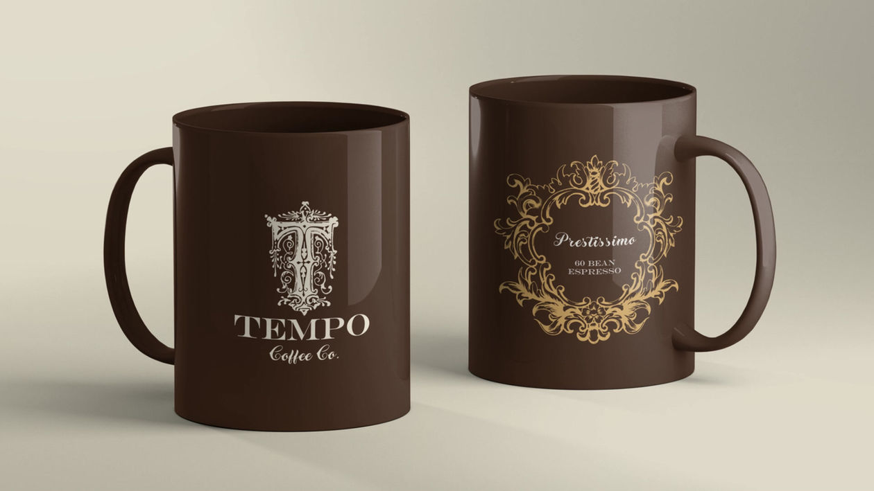
Tempo Coffee Co is a boutique coffee brand that bridges the worlds of classical music and craft coffee, designed to reflect both the richness of flavor and the rhythmic pace of music. The identity draws deeply from my personal experience as a violinist of over ten years and a lifelong admirer of classical composers.
-
Each roast in the lineup is associated with a composer—J.S. Bach, Wolfgang Amadeus Mozart, and Ludwig van Beethoven—aligning them with a musical tempo that identifies their music.
Brand Strategy
-
The design strategy for Tempo Coffee Co began by identifying the core strengths and stylistic signatures of each composer's unique voice to classical music. Those creative identities became the foundation for the brand’s coffee flavor profiles.
-
The challenge was to translate each composer’s legacy into taste by matching a musical tempo with the strength of coffee.
-
Largo (slow)—decaf
-
Adagio (slow)—breakfast blend
-
Andante (walking tempo)—light roast
-
Moderato (moderate)—regular roast
-
Molto (very)—sumatra
-
Allegro (fast)—dark roast
-
Vivace (lively)—espresso blend
-
Prestissimo (very, very fast)—espresso
Brand Personalities
-
Bach represents structure and depth—just like a bold, balanced medium roast. His music is methodical and timeless, much like a classic morning brew.
-
Mozart brings elegance and clarity—reflected in smooth, harmoniously blended coffees that energize without overpowering.
-
Beethoven channels intensity, emotion, and drama—perfectly aligned with a dark, full-bodied espresso.
Visual Identity
-
The name “Tempo" was chosen to encompass the pace of music all classical music adheres to. Tempos are very critical in performing and interpreting classical pieces the way the composer envisioned.
-
A refined serif typeface, rooted in classical design, evokes the elegance and structure of the Romantic and Baroque periods, grounding the brand in tradition while allowing space for expression.
-
Tempo's packaging and visual elements deliberately draw inspiration from orchestral scores, Romantic-era aesthetics, and classical musical notation—creating a brand that feels expressive and alive.
LOGO/IDENTITY, NAMING, BRANDING, PACKAGING


